Tuesday, September 30, 2008

Websites: Good and Bad

http://www.thecreationmuseum.org/ is an example of a site that uses an all black background which makes it a little tiresome to read although besides the red font, the colors are not that damaging to the eyes. There is no menu bar and everything is center justified. There is no unity in color or font size so unless everything is read it is hard to understand what is most important on the page.


Wired.com
does a good job of using size and font to clearly show what is the newest content on their Website. Their use of graphics also make the stories more appealing.

Analysis of Web site design by Vicki

TeacherXpress.com is most certainly an example of a Web site with poor design. The site fails at satisfying the simplicity that is needed to create a successful site. There is too much text that is small and close together, making it difficult for the viewer to read, let alone use. The page is very long, requiring several scrolls to get to the bottom of the page. And the entire page is boring! There are no graphics; it is simply a repititous pattern of purple and orange boxes containing way too much text. A viewer who came upon this site would not stay for very long-the purpose of the site is a mystery.


National Geographic's Web page would qualify as a site with sound design. The site is easy to read and is easy on the eyes, using neutral, but certainly not lacking, colors. The site also looks unified, is simple, and short (there is not much scrolling involved). Navigation bars on the left and top of the page are helpful in guiding viewers to more information. New postings to the site are found on the main page.

Friday, September 26, 2008

Open-Sourcing the U.S. Election

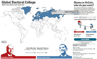
Here's an intriguing feature from the Economist, the formerly print-bound magazine that is moving creatively into the dynamic Web. Its "Global Electoral College" invites people in other countries to signal how they'd vote in the U.S. presidential contest. It presents a world map that assigns "electoral college" votes to each of 195 countries based on population. A "vote now" button lets people "vote" and then displays worldwide results on a map coded blue for Barack Obama and red for John McCain.

So far, the more than 12,000 votes cast overwhelmingly favor Obama. Only El Salvador leaned red when I rolled my mouse around.

But as with many interactive maps, this one makes it annoyingly hard to pinpoint smaller locations; I wound up clicking through to the text table to read a more informative explanation of country-by-country results.

Monday, September 22, 2008

citizen journalists report from 'purple states'

I think the 'Purple States' section of washingtonpost.com is one of the most important interactive sections of the press.
It gives the audience the opportinity to cover the elections from their local towns.
Purple States citizen journalists join forces with washingtonpost.com to cover the issues that matter most to Americans leading up to election day

Obama's Website: Past and Present

Slate.com has posted an article that shows changes in the information contained on Obama's website since the convention. Using Versionista, readers can follow links to specific portions of his website such as education, social security, rural-issues and Versionista gives both the previous Webpage and the current one side by side, with deleted information highlighted in pink and added information in green. This is really interesting because it allows us to see possible policy shifts that Obama has made since winning the nomination.

Comparisons like this, since they deal with a website are best communicated using the Web. The links allow for the actual article itself to be quite short while letting the user decide how much they want to read in to the facts. A user can either go by what the author is saying or investigate for themselves. Having the documents available at the click of the mouse is very credible for the journalist as well.

Yahoo!'s 2008 Political Dashboard

One interactive news site that presents information interactively that couldn't be done in print is Yahoo! News, which presents the electoral college map in its "Political Dashboard." The dashboard encourages users to take the map, which is pre-set with current poll data, and create their own scenarios as to how the election will play out.

Just for fun, it includes the scenarios drawn up by Arianna Huffington (which has Obama winning with 306 electoral votes) and Newt Gingrich (who says McCain will win with 300). In addition to the create-your-own-scenario interactivity, users can also view past maps for American elections dating back to 1988.

Tracking the candidates across the nation

MSNBC.com's Decision 08 Dashboard is a Web site specifically designed to provide information about the presidential campaign using text, graphics, sound, video, and rich content. The focus of the site is on interactivity, not on in-depth news reporting, so there are plenty of visuals to attract the reader.

The most interesting feature I saw was the Maps & info graphic, which shows a map of the United States, with some states being marked with flags. When the user points his or her cursor over the flag, a text box pops up on the map. The text box tells the user which candidate will be in that state on which day, and for what reason. Users who are following the candidates now know what they are up to, and where to find them.

The site takes advantage of online journalism's multimedia capabilities, interactivity and ability to allow users to control what information they want to receive, which print and broadcast journalism cannot do. The map in particular probably employs rich content plug-ins, which allow rollovers to provide more information to readers.

Vintage Political Ads from Slate V

This video from Slate V features several vintage political ads. John Dickerson, Slate.com's Chief Political Correspondent, narrates the video and introduces the video by saying that because he's sick of this year's campaign commercials he visited the Museum of Moving Images to track down some of his favorite political ads from the last 60 years.
While it could be argued that this video might appear on the evening news, it probably wouldn't because of its length. The ads are somewhat long and need to be watched in their entirety to fully appreciate them. There's even a link posted under the video that takes viewers to the site where Dickerson found the videos so viewers can check out more on their own time.

Politico: "where red and blue meet purple."

Politico's website offers a 2008 Swing State Map that is quite informative. The map allows users to click on each of the swing states for the 2008 presidential election, and gives facts about how that state has affected each election. This map gives up-to-the-minute data at the request of the user -- something a newspaper or television would not be able to do. The data goes back to the 2000 election, and users are able to see if a particular swing state favors Obama or McCain, and how winning (or losing) that state will affect wach candidate's chances at the presidency.

USA Today's way of keeping score

My site is USAToday.com. The story I chose was “McCain has biggest spending month in August”. A newspaper or TV broadcast could not accomplish this arrangement because the story is accompanied by both an electoral vote and campaign ad tracker. A TV broadcast does not have the time to get into the details of the story like a newspaper, yet the newspaper cannot offer the multimedia options of the television because it is impossible. Not to mention, the story includes active links so that users can find out more information on the particular people involved with the story. With this story, users get the best of bother worlds.

CQ Politics: Build Your Own Presidential Race

The interactive presidential map on CQPolitics.com allows users to project their own scenarios of the election outcome. For example, clicking on the swing state of Colorado shows that, all other things being held equal, even if it went red Obama would still hold a lead over McCain.

This multimedia type could not work in any other medium. A TV station or newspaper could provide a colorful map of any given poll results for election outcomes, but neither would have the option of personalizing the outcome of each state to see potential results.

CQ Politics also gives a historical timeline of presidential elections since 1968, showing which state went to which candidate and further breaking it down by electoral votes per state when clicked on. Another "purple" map gives the average percentage-point margin of victory in each state for the past five elections, and yet another shows the national breakdown based on the site's own race ratings.

The nature of interactivity in online journalism allows for such enhancements that would not otherwise be possible in print, radio or broadcast journalism.

MSNBC.com users predict election outcome

MSNBC has an interactive feature called iPredict, in which users can predict the outcome of the presidential election. There is one chart for " John McCain will win the U.S. presidential election", and likewise one for Barack Obama. The user selects and clicks one symbol indicating two thumbs up, one thumb up, thumbs down or sideways based on how likely they think that outcome is. Sideways means "toss up". The graph for McCain shows a big spike in users who said a win was likely after the Palin nomination. Users can switch views between the past month, 3 months, and 1 year. It also gives data on number of voters, average vote, and percent change over the past week. One thing it seems to be missing, however, is a way for the user to view both graphs at the same time to compare what readers predict for Obama and McCain. The feature is obviously interactive because it allows users to give their input in some way, and compiles all the votes to create a data set based solely on user input. It would be interesting to see those kinds of numbers for readers/viewers of different newspapers and tv stations, , but can't be done through either of those mediums.

WSJ: Interactive Graph of Pre-Election Polls

Wall Street Journal's interactive graph allows users to track pre-election presidential polls taken by different news firms and polling groups in key battleground states and nationwide. John McCain and Obama are positioned vertically on the graph with the midpoint of zero representing a tie. The timeline starts in June and the media companies are color-coded.

Some key states include Virginia, California, Pennsylvania, Ohio and Florida. Media firms include CNN, USA Today, CBS and Newsweek.

This graph allows users to select which information they are most interested in looking at on the graph, an interactive feature of user control that is a characteristic of online news. For example, they can select the media firm whose poll they are most interested in and select which key state they want to see by clicking on the tabs. Given the number of space and time in media such as newspaper or television, editors and producers will most likely have to select which key states and media polls they think are most important to the reader.

The Forum on CNN.com

"The Forum," an interactive part of CNN's online Election Center, is exciting to both the politically-proud and the politically uneducated. A venue for viewers of all voting types (targeting those who label themselves first time voters, political junkies, conservatives, independents and/or liberals), visitors to the site can find where they stand on issues compared to other site participants and share (or simply read) political opinions and/or concerns on several comments pages. Visitors can join "leagues" of voters and share their comments more specifically with people who have similar political ideas.

The purpose of the site is to, through interactivity and visitor participation, encourage dialogue among voters in the upcoming presidential election. This could not be done at the same degree by a print publication, radio or television broadcast because such media could not handle the same amount of traffic; a virtual dialogue can support the involvement of MANY more participants than a newspaper article, radio or television panel.

Pick your President on Washingtonpost.com

Users can give their best guess of who is going to win the presidential election in Washingtonpost.com's Pick Your President Contest. The contest allows users to pick which candidate will win each state and automatically tally's the electoral votes. Users look at a map and click once to give a state to Obama and twice to give the state to McCain. The interactive map provides historical information about the previous outcomes in each state as the mouse is scrolled across the state. The user can also see trends amongst other people who have filled out the map, maps submitted by others and the latest campaign research. Once they make their picks, the user names their map, provides a brief explanation of their picks and enters their contact info. The person with the highest correct score in the electoral college voting wins a $500 Best Buy gift card. This allows users to create and share their own content and even potentially win a prize for it. A newspaper or TV station does not have the ability to recieve direct information from users like the internet does.

New York Times' Presidential Polls

The New York Times Web site has a tool which allows a user to look at the most recent data from 14 national polls -- including USAToday/Gallup and Pew -- and 10 state polls about the 2008 U.S. presidential election. The Times charts the data, showing how the polls have changed over time. Users can scroll their mouse over a point in the graph and more information: the date of the poll, the exact percentages and the margin of error appear.

This kind of chart couldn't be achieved in any other medium because it is completely interactive -- the user in in control of what he or she wants to look at and click on. It also centralizes the major presidential polls in one place, providing ease of use in addition to interactivity.

See How They Run on ABC News

ABCNews.com has an interesting poll tracker on their politics site. What they've done is set up a poll tracker between Obama and McCain. The tracker is interactive so you can select things like "overall", "age", or "income" to see how different people vote depending on their background. You could present the same information in a newspaper but only as a very large graph. It is much easier to use the interactive version on the internet because it is much more concise and can easily and quickly narrow down the exact information you're looking for in voting habits. This is a prime example of how the internet can make news much more user friendly then trying to quickly catch the information in a television news program or read in a complex graph in a newspaper.

Patchwork Nation

Patchwork Nation on the Christian Science Monitor's website breaks down states counties and classifies them not only by the party for which they usually vote, but also by 11 categories (boom towns, evangelical epicenters, immigration nation, etc.). Each category has a profile with polling data, and CSM has bloggers reporting from a representative city in each category. There is no way that the CSM could use print or television media to pull this off; the nature of the Patchwork Nation makes it a non-linear report, meaning that television could not pull it off. And, the interactivity required in exploring the different traits of the various regions could not be done in a newspaper. Sure, CSM could print the map, but it loses so much without the rollover profiles and the instant access links to the category's blog, that it would not be anywhere near as complete.

Washington Post Interactive Electoral Map and Contest

The Washington Post has an interactive electoral map as well. You pick which states will go to McCain and which states will go to Obama, then enter your map into a contest. The winner gets a $500 gift certificate to Best Buy. They also have a feature called "starting picks" which helps you fill out your map. One, swing states, gives each non-competitive state to its appropriate candidate and then leaves the swing states left to fill out. Another "starting picks" feature will highlight the map by the 2004 results. What is unique about this compared to Tv and print media is that it can go through all the potential electoral scenarios in a much faster and easier to visualize and understand way. It also allows for instantaneous response to a contest/promototion that TV or print media could never get.

Monday, September 15, 2008

Breaking News, Large Sites: NYTimes.com, Eliot Spitzer's Resignation

The New York Times won the category in Large Sites for breaking news. According to The Online News Association, "The winner 'hit it out of the park.' The winner could have held the story but chose not to.”

The New York Times was able to break the story with through tips and keen reporting when they learned the unusual presence of lawyers and an FBI agent in a federal district court in Manhattan. But what was particularly unique was they broke the story on the web instead of holding it and continually updated it throughout the day while no one else had anything.

On the website, they included video, timeline and also provided answers on how they broke the story through a Q&A through their metro blog which provided a platform for users to comment and ask questions.

For Breaking Online News Content, NYTimes Rings True

For using web resources to break the news of Eliot Spitzer's resignation and link to a prostitution ring, The NYTimes.com won the Breaking News award for large sites as part of the Online News Association's Online Journalism Awards Sept. 13 in Washington, D.C.

NYTimes.com created a superb multimedia web package devoted to all-things Spitzer when the story broke in March. It offers an interactive way to expand their coverage of the story and feed readers' need for news. If seeing a video of Spitzer's tear-filled apology isn't enough, an interactive timeline of his life and career highlights-- complete with pictures-- offers readers another glimpse into the former Governor's life.

In addition to linking all relevant stories, the package includes a podcast and link to an in-house bio complete with all archived Times stories relating to Spitzer.

This gives readers a place for one-stop shop coverage, and its easy-to-navigate, reader-friendly site makes the Times worthy of its award.


Las Vegas Sun Shines Online

The Las Vegas Sun’s website, which was the winner of the General Excellence category for medium sites in the 2008 Online Journalism Awards, provides a ton of information in an easy to use format while taking advantage of multimedia potential. When first looking at the page, it is clear that the first priority is news. It has the latest news at the top of the page, followed by prominent stories in other news categories. The front page provides so many things to look at, yet is not overwhelming. It also encourages readers to get involved by providing a “Most read,” “Discussed” and “Most E-mailed” near the top of the main page.

Once you scroll down a bit on the main page, the multimedia aspects of the site shine through. Currently in their “spotlight” section, they have a history of Las Vegas with tons of multimedia options, all of which are interesting and informative. The interactive casino map provides a more interesting look at the strip than just reading about what each casino offers. The “Implosions” section provides some fun (who doesn’t want to see an empty building being blown up) and some history, with a blurb about each of the casinos that are no longer standing.

Off the main page, in addition to the usual Arts and Entertainment, Sports and Opinion sections, the links off the top also include an entire multimedia section. This section includes videos, slide shows, and other multimedia options on everything from sports to a flight delay calculator. There is also a blogs section covering all topics with multiple blogs on each one. Most of the blogs had been updated within the past week, and some had been updated within the last few hours. Overall, the site serves those living there with the latest news as well as those visiting or looking for information with their variety of articles and multimedia sections.

"Bearing Witness" to an Award-Winning Multimedia News Site

After looking at the Web sites of the Online Journalism Award winners, I observed that the incorporation of multimedia is key to creating a successful news site. Reuters’ online feature “Bearing Witness” is one such site; it was named the best news site for a Multimedia Feature on a large site. The site tells the story of the Iraq War through testimonials from Reuters reporters, photographers, and other staff using photos, audio and video.

I find using multimedia elements is more effective in creating an emotional impact on viewers (specifically myself) than simple text. Not only do photos, audio and video on the site spotlight journalists who were on the ground, they also depict war photos and footage that bring their personal stories to life and make them much more compelling than they would be in textual form.


Other features such as a comprehensive timeline and maps provide further understanding of the war for those who would like to know more.

Investigative Murder Piece wins Small Site Award

RecordOnline.com, the winner of the Online News Association's award for Investigative Journalism, Small Site, is a multimedia reporting package with several compelling features.

"I Didn't Do That Murder": Lebrew Jones and the death of Micki Hall
includes not only the investigative report, but additional video interviews, maps and timelines. Being a Law & Order fan I was immediately attracted to this story and wanted to read the entire article and check out everything else on the site.

The story is laid out in 10 chapters with accompanying photos, and users can click through and read the entire story. Within the story are links to video interviews with sources in the story.

This site also features a map of the murder scene and a timeline of the investigation and arrest of Lebrew Jones. The map and timeline are very detailed and offer users a visual image for better understanding of the entire investigation. The map includes links to an expert's analysis of the crime, including the expert's contact information.

Armytimes.com blasts through the competition

Armytimes.com won in the “general excellence” for a small site category in no small part because of the overall sheen of its site design. The multimedia box located on the right side of the top of the page, for instance, harnesses the Internet’s full capabilities of delivering non-text-based, non-linear news. Without taking up space or being overly bulky, the feature presents five multimedia elements in a creative way. Each item has a tease that, when the cursor moves over a different item, cascades away, imitating the motion of flipping through file folders.

Also noteworthy is the site's feature on the 2008 Paralympics—it takes full advantage of the Internet’s ability to display stories in a non-linear manner. Instead of displaying one long, texty story about which athletes won which events, it displays links to six short profiles of events and people of interest in the Olympics. It also links to an entire page done by militarytimes.com that is bursting with multimedia features on military Olympians. ONA cites its knowledge of its audience as one of Armytimes.com’s assets, and this is very evident: almost all of the articles somehow relate news back to the Army or its soldiers.

An Old guard Breaks Spitzer's Bubble with New Methods

NYTimes.com, the New York Times' Web site, won the 2008 ONA award for large site breaking news for its coverage of former New York Governor Eliot Spitzer's resignation in March.

The Times deserves distinction because it did what most print newspapers are afraid to do: It broke the story on the Web, with full coverage, before anyone else. The Times used the Internet to its full advantage, breaking the story as soon as its cool and providing supplemental multimedia.

The story comes with an interactive sidebar, a timeline of Spitzer's rise and fall, which allows users to click on dates for photos and blurbs about events in his life. The Times also included video of Spitzer's public apology. In addition, the Times' Sewell Chan takes visitor's on a full back story of the Spitzer scandal with a 6-minute audio clip.

But still, the Times is most commended for not hesitating to break a major story -- with in-depth reporting and supplemental material -- on the Web, before its newspaper went to the presses.

Talking to the Taliban

This was an in-depth look at the Taliban that included more than 40 interviews with Taliban fighters. Without the internet a piece like this would be almost impossible to distribute because of all the video footage. The footage could have been edited but by leaving the interviews whole it allows the consumer to interpret ourselves.

There are many different parts to the piece including one that explains the methodology used which gives the piece more credibility in my opinion. If all of this as put into paper form it might take up an entire newspaper and would be incredible dull but the video makes it seem more real.

There are also several Charticles explaining the different tribes of Afghanistan and the rates of suicide attacks.

See for yourself, the piece can be found here.

Online Journalism Awar Winner- Las Vegas Sun

The main thing that struck me at looking at the website of the Las Vegas News Sun is the amount of information they have posted on their front page. While some may consider it crammed, I see it as a very easy way to be able to view all the local news stories from the day in Las Vegas. I also enjoyed the interactivity of the site, from its blogs and comment section to the amount of video they link you too. For example, the UNLV football team had a big win over Arizona State Saturday and directly on their home page is a big video with highlights from the game. It is probably the one of the highest quality online highlight videos I have seen on a news site, and that includes ESPN. They also have links to videos from other sites, including a link directly to the NBC site for video of the Palin/Clinton SNL skit which many people will click on if they happened to miss it.

"The Hidden World" Uncovers Secret to Great Online Journalism

The Hidden World at GEO.fr won the 2008 Online Journalism Award for best multimedia feature on a small Web site.

The Web site presents digital maps and interactive graphics as the focal point of the page to attract users. The sleek black, white and green design makes the page look somewhat mysterious, which suits the purpose of the Web site: to investigate and report "hidden" stories around the world.

Each story is accompanied by online video clips, photos and colorful maps.
The Web site seems to be designed to appeal directly to people who prefer to get information from visually-appealing graphics instead of the traditional article.

Overall, the site is very innovative and takes full advantage of the user interactivity that online journalism allows. Thanks to its various multimedia features, "The Hidden World" has gained recognition for being able to collect, connect and present its content in a creative way.

WebMD takes the award for Specialty Site Journalism

I reviewed the winner of the Specialty Site Journalism site WebMD. I thought this site had a lot of easily searchable information, which I’m sure was the main reason it won the award. The site’s search feature makes it very accesible and easy to quickly use when searching for a particular medical problem. Typing in “headache” for example in the search bar yield information on different kinds of headaches, causes, and remedies. The information on the site isn’t limited to a simple text descriptin either. Many of the pages conain links to other sites yielding more relavent information and in some cases there is actually movie clips you can view with information on certain conditions. There is also a blog link spot on the home page which gives users the ability to block about various medical conditions and cures. You can also ask an expert a personal question in diagnosing a problem you may have. The real value of the site comes from simple and quick accesability to a large amount of useful information.