The sites we researched and found to be innovative are Kaboodle and Stylehive.
Stylehive is more innovative because it integrates elements of MySpace with the interactive concepts of social shopping found in Kaboodle. The main purpose of the site is to allow users to share with others things they found to be fashionable. Stylehive users can personalize their profiles, blog about fashion, and establish their own communities. Like Twitter, users can choose to “follow” others and comment on their profiles.
In Kaboodle users make tons of lists, and if they're social oriented (hot scarves in 2008) then others can use them. Otherwise, you just end up with a hyperlinked shopping list. Kaboodle attempts to foster such a network by creating a leaderboard-type arrangement, called an “A-list,” where the most active Kaboodlers are featured and, as an incentive, given “exclusive deals and discounts!” The first-added tag rewards people for making good finds, and encourages people to be innovative. Users can start a blog based on various themes such as shopping for prom dresses.
Bad points: Users have to add the “Kaboodle” button onto their browser, so they can’t necessarily “kaboodle” everywhere.
Monday, November 17, 2008
Photo Sharing Web Sites
We found Flickr to be the most innovative of the photo sharing Web sites. It is innovative because:
- Site is used by both amateurs and professionals.
- Able to search for photos by place using an interactive map and tag photos by geographic area.
- Comment directly on photos (not just underneath).
- Similar to social networking site; able to have "friends" and join "groups."
- Emphasis on the artistic aspect of photography.
- Easy to use, navigate.
- Difficult to navigate.
- Purpose of site unclear.
- Photos/video are meant to be viewed on mobile technologies. This requires higher-end devices, limiting users to those who can afford it.
- Less organized than Flickr (the homepage was overwhelming).
- Standard commenting (underneath photos).
Who cares about social aggregators
Who cares?
As a group we were underwhelmed and unimpressed by the content of social aggregators.
We didn't see anything innovative about the sites we researched. All of the sites offered the same basic idea and no one site stood out. We also questioned if there is anyone out there who would want to use a social aggregator.
We looked at about a dozen sites and only found one that could be relatively interesting. Profilefly.com combines not only social networks, but also blogs, photo sites, love and dating, and professional profiles.
Video Sharing Sites
For our class assignment, we've explored social media through the video sharing sites below.
Youtube may be the overall leader in video sharing site, but these other sites are popular because they serve different functions:
Hulu This site hosts full length tv shows and has better quality. It also has special news categories including a category called "Election '08" which has all debates and other videos pertaining to presidential campaigns. Vimeo also has a category of HD videos, as well movie excerpts. Everything is organized into categories so videos are easy to search. Vimeo also has comprehensive and accurate information about the video. Television shows are timely uploaded, showing up a day after it was broadcasted on TV. - Nadia
Stickam - People can broadcast themselves live. Most of the radio stations are using them and users can chat with whoever is broadcasting. There are also some people who broadcast themselves playing games. MySpace bought it last year. -Utku
Vimeo Shows videos has a socialization aspect to it because you can have a feed to your videos, you can add friends and have subscribers. Vimeo also has channels allows you to showcase videos with common themes. It also has a category of HD videos and a Vimeo Badge section where you can make a montage of all your videos. Vimeo also allows you to manipulate video, such as making it superslow or superfast for special effects. -Shaleem
Your Truman Show attempts to add social networking to videos, like a mashup between Facebook and Youtube. Features include timelines for connecting video stories, which let people do episodic video storytelling and create social groups around those video threads. The site recently announced a new widget it calls "Video Map" to integrate with Facebook profiles. It's like a video diary where people talk about who they are and their day, hobbies, experiences etc. - Matt.
Veoh is attempting to bring Internet video to TV screens. It's similar to Hulu in that it brings TV to the internet so that people can watch their favorite tv shows when they want to. It's different and innovative from Youtube because they don't have to deal with copyright issues since they get their content legally from the TV networks and studios and they also can have long video formats up to about 40 minutes in length. - Hannah
Youtube may be the overall leader in video sharing site, but these other sites are popular because they serve different functions:
Wednesday, October 22, 2008
Effective and Ineffective Representations
1. FredFrap.com
Fred Frap’s homepage as a whole is still very busy. The color scheme was poorly chosen and distracts readers from what is meant to be focused on. I dread this site because my eyes are over-stimulated. Also, the way the information is organized in a floating manner makes the homepage far from user friendly.
2. Yahoo.com
Yahoo’s homepage, on the other hand, is easy on the eyes. It does its best to create clean lines of separation between each section so you can see where everything is located without feeling overwhelmed by the choice of what to click on. This page has much information to offer, yet it does so in a more tasteful way.
Monday, October 6, 2008
Good and bad design

I think an example of good design is the old Facebook.com, which was simple in design and didn't have many of the bells and whistles it does today. It was an effective tool for socializing online because there wasn't a bunch of nonsense you had to sort through in order to get to what your friends were trying to say to you. It was a simpler time.
 An example of a Web site trying to do too much with its layout would be new Facebook. I think Facebook has gone off their rocker and 99% of the stuff on the site now is worthless. What's up with that map with people in different countries having lines drawn between them? I don't need that. I've been used to the little log-in box being in the same place for the past four years. Why change it up on me now?
Facebook: Don't mess with success.
Good v. Bad Designs
The Bad: Creation Museum

This site is an example of bad design because it does not have much of a hierarchy on the page, has no photo (just a background picture), and has hard-to-read text because of all the neon colors. The title of the museum is also broken up into different font sizes, styles and colors, which makes it hard to determine what the name of the museum really is. The rest of the text is simply stacked below the title, without a particular order of importance. And the use of bright colors and shadows is very distracting because it clashes with the background.
The Good: Indian Legal Affairs

This site is an example of a good design because it looks clean, attractive and easy to navigate. Although there are several different colors on the site, they complement one another well and match the colors in the photo on the top of the page. The site also has an air of professionalism and order, which is shown by the descending font size of the titles as you scroll down the page and the menu bar on the left side of the page.
Good Web Design vs. Bad Web Design
Good Web Design

I think ESPN is an example of a site with good Web design. The site includes a lot of information, but is not overwhelming. The text is black, which keeps it simple, so as not to clash with the photos. Additionally, the site utilizes tabs to link to different sports, which prevents clutter on the home page. Finally, the pictures not only coordinate with the topics on the home page, but they are placed on the page from largest to smallest, which shows importance.
Bad Web Design
 An example of bad web design can be found on the Tally-Ho uniforms website. The site is extremely distracting. The flashing ad caught my attention before the title did. The cloud background with planes flying across the page also prevented me from focusing on content. There are too many fonts used and the sizes vary across the page. The designers also went overboard on the use of "special effects." If I were trying to purchase uniforms, I would stay away from this site regardless of the deals they offer because it is entirely too hard to read.
When Good Web Design Meets Bad Web Design
Good:

Music Web site Pitchfork is a prime example of excellent Web design because the site's elements are unified, simple and in harmony. The site is clean, with similar fonts and colors, as well as a tidy organization. Each section of the site is clearly labeled and slightly different then its neighboring sections, yet there's a unity in fonts, colors and layout. The navigation bar on the left follows from page The site also keeps advertising off the main part of the page, clearly in the margins.
Bad:

Poolesville Online's Web site shows a few flaws in Web design. For one, the site is a bit cluttered, with everything seemingly squeezed into its position. The site attempts harmony with its main stories on the homepage, but ends up making each story look the same, eliminating any sense of prominence. The site's ads change size, oftentimes cutting into editorial content. There's also a running scroll on the main page, which is distracting and serves no real purpose. While there is a navigation bar at the left, the color of it changes, making it somewhat distracting. The page also shifts left or right based on which link you click. Poolesville Online isn't horrible, it just lacks in simplicity, harmony and cleanliness.
Good vs. Bad Design

Good Design:
The Chicago Sun Times, one of Chicago's main newspapers, has a really good webdesign. The main story from the day's paper is usually front and center on the page. It is also easy to navigate through as links to the other sections are at the top. The front page also allows you to scroll down and find an easily accessible list of the columnists that have written today. Besides the one big story, all its pictures and headlines on the front page are not very big, allowing someone looking for a specific story to scroll through without being overwhelmed by one or two story headlines and/or pictures.
Bad Design:

In direct contrast with the Sun Times web design is Chicago's other paper, the Chicago Tribune. While the Tribune usually has the better content, the front page of its website is much harder to navigate. Unlike the Sun Times, its sections are not at the very top, but on the side. It also has much bigger headlines and much bigger photos on the front page, making it overwhleming if one is trying to search for a specific news story. It also has no links that shows which columnists have written recent columns. (you would have to scroll through the entire list of columnists to find out who wrote when.) The front page is also further cluttered by large advertisements. On news stories, the link to change a story to print form is also located at the very bottom of the article, so one has to scroll to the bottom of the article each time he/she wants to print.
Good and Bad Web design
Good design:
 Washingtonpost.com is one example of a well-designed Web site that makes its content easy to read and navigate. It has a main story and photo to attract the reader to the headline news of the minute, with the most previous past posts directly below it. The Web site banner is easy to find and makes it clear what the Web site is at the top. The main colors of text on the page are black and blue so as not to be too distracting. Also, each category of news throughout the page is separate in a nice and neat box which makes navigation that much easier.
Bad design:
The Jerusalem Post's Web site, Jpost.com, is similar in layout to the Washington Post's with its main news at the top of the page accompanied by a large photo, but the site overall is much more difficult to read. The main obstacle to the page is its overload of ads, which make it confusing to differentiate between what is news and what is not. They have a large ad at the top of the page about the same size as the flag that reads The Jerusalem Post that one almost isn't sure whose page it is right away. The rest of the news sections are broken down into columns, but those are also interspersed with columns of ads and classifieds. There are also a lot of different colors used throughout aside from the standard blue or black text, such as bright red, green and orange, which makes it hard for the eye to focus on one section at a time.
 Washingtonpost.com is one example of a well-designed Web site that makes its content easy to read and navigate. It has a main story and photo to attract the reader to the headline news of the minute, with the most previous past posts directly below it. The Web site banner is easy to find and makes it clear what the Web site is at the top. The main colors of text on the page are black and blue so as not to be too distracting. Also, each category of news throughout the page is separate in a nice and neat box which makes navigation that much easier.
Bad design:

The Jerusalem Post's Web site, Jpost.com, is similar in layout to the Washington Post's with its main news at the top of the page accompanied by a large photo, but the site overall is much more difficult to read. The main obstacle to the page is its overload of ads, which make it confusing to differentiate between what is news and what is not. They have a large ad at the top of the page about the same size as the flag that reads The Jerusalem Post that one almost isn't sure whose page it is right away. The rest of the news sections are broken down into columns, but those are also interspersed with columns of ads and classifieds. There are also a lot of different colors used throughout aside from the standard blue or black text, such as bright red, green and orange, which makes it hard for the eye to focus on one section at a time.
Sunday, October 5, 2008
Good and Bad Web sites
Good Web site:

Baltimoresun.com is an example of a good Web site. The main story (about another Ravens loss) is clearly displayed in its own box with a picture, accompanying text and additional links. The font for the headline is also the biggest on the page, indicating that it's the focal point for visitors. There is another box next to the main story with the most recent headlines. The rest of the site is pretty easy to navigate. As you scroll down there are links to the other print sections as well as links to the paper's blogs. There is unity throughout the site with the blue headlines and black text, and further down the page sections are broken up with red text.
Bad Web site:

Rogerart.com is an example of a bad Web site. There are too many colors on the page and there is no clear indicator at the top of what this site is even about. The links in the picture are to other sites that I think the creator ("Roger") of this site designs. Further down there are some big images with writing all over the border of someone (Roger?) painting. I can't tell what this site is even about, and along the sides there are links to what look like ads but turn out just to be links to other sections on the site. There is no sense of unity or hierarchy on this page.
Good and Bad Website Design

Good Website:
FoodNetwork.com is an example of a well designed website. It is very easy to tell right off the bat what the website's content is based on. It is also very easy to use with a clearly defined navigation bar with drop down menus at the top of the screen. There is also a search bar at the top for easy use. If you're looking for a particular recipe there's a recipe finder you can use by putting in different search criteria. The site also shows good contrast with using different fonts and colors for the navigation, titles, and content. The site exhibits a fairly simple design and doesn't go overboard with flashy pictures and graphics. There is also harmony and repetition throughout the site with font, titles, and colors.
Bad Website:

UsabilityNet is a good example of what not to do when designing a web page. You should be able to tell what kind of site a web page is by just pulling up the home page. On this site it takes some snooping around to even figure out what it's purpose is. What this site does is list a navigation bar at the top and then just re-list the links with their content below. It would look better if the designer had simply placed a larger mission statement on the home page and then let the user select within the navigation where they wished to visit. This site also does not show any contrast. Titles are not that much larger then regular font on the page. The navigation should also be somewhat distinct from the content of the page but it's not. There isn't any differentiation in fonts, which there should be to distinguish between titles and content. The page also doesn't let you see everything put together on the same page and you have to scroll down to see the rest of the content. This is another reason why the content links shouldn't all be jumbled on one page. About the only thing going for this site is simplicity, and that is because this site is simply bad.
Bad and Good Websites
Well-designed website:

An example of a good website is www.nytimes.com. It has a simple, clean look and is easy on the eyes as it utilizes dark colors for font (black and blue) against a white background. The name is squarely in the middle and at the top of the website and the colors are used in a consistent manner with blue for headlines and black for categories. The ads are placed to the sides and are small so they are not obtrusive.
Everything is also easy to navigate with a sidebar on the left with links to different sections of the paper. Tabs are also employed to let users go to other parts of the paper that may be of particular interest, such as the print version or what are the most popular articles.
Poorly designed website:

An example of a bad website is http://www.kongkaffe.no/. The color scheme is tacky and strains the eyes and is overwhelmingly brown. The site also has a lot of unnecessary images and animated graphics that spin, blink or move but have no purpose. Fonts are not consistent and in different sizes with no rhyme or reason. Worst of all, the website loops rather annoying music while you are on the site without any option to turn it off.
There is a side bar on the left that help users navigate through the site. However it seems that the middle and right columns of the website could be utilized much better if it was more organized and had more useful information.
Websites-Good vs Bad
Good:
http://www.hp.com/
This website is very easy to read, which is important because it is selling products and you would not want to get users confused. The web page design is simple and I like its use of harmonious fonts and colors. The clear links and navigation tabs, makes maneuvering to the various sections of the page easy. The placement of pictures of its products grab your attention. I think this website is good overall because it fulfills its purpose by making it easy to view and buy hp products.
Bad:
http://www.alternativetransportservices.co.uk/
How do I count the many ways in which this website is bad??? It is supposed to be providing a service but besides its jarring heading in neon green that says "Alternate Transport service," I have no indication of what they do and how to get this information. The background is black and the text is brightly colored, making it difficult to focus and read. The flashing icons and pictures littered throughout the page are also very confusing. The page is loaded with so much text that you have no idea what you should click on. If you do however decide to click on the navigational tabs on the top left corner of the page, it takes you to other pages that are just as colorful and confusing as the main page. This is probably one of the worst websites that I have ever seen.
Thursday, October 2, 2008
Good and Bad Website Design
 Ugly design: Miniclip free games site. This site bombards the user with graphics and video. The ads take over the screen and it is hard to figure out what is an ad and what is a game. There is a video of a game and also a video of an ad. To get to the list of games you have to scroll way down the screen and then through a massive list written in a small font.
 Nice design: University of Maryland homepage. UMD's homepage is simple and does not require much scrolling. It has the links bar across the top and other links down the left side making the link you want easier to find. It also has a compact area where you can scroll through events while on the page which is convenient but still pleasing to the eye and does not require scrolling.
Design Analysis

Ugly: Craigslist.com
The Web site that immediately jumps to my mind when I think of inefficiently designed sites is Craigslist. Though there are no lurid lime greens or hot pinks jumping off the page, the essentially monochromatic blue design is very minimal on contrast, making it hard to really read anything. Though it does make use of a grid pattern, the site is very texty and fails to really separate any of the elements with space, meaning that the viewer's eye is not really drawn anywhere. There is so much text, one essentially has to use the "find" function of one's Web browser to be able to locate the desired link.

Effective: Cnet.com
Cnet.com packs a lot of content in the first page scroll. When opening the site, you can immediately tell where your eyes are supposed to go: the main "iTunes-scrolling" box in the upper-left corner that features one of six different stories. It features site navigation across the top, an eye-catching and convienent location. It also features a horizontal design of "stories" organized by topic, meaning that once someone scrolls down, all the information is right there. Not only does this prvent "scroll fatigue," but it makes finding information very quick and easy.
Wednesday, October 1, 2008
High school websites: Nice and Ugly
http://phs.prs.k12.nj.us/ComputerClub/ is the website for the Computer Club at my high school in Princeton, NJ. Interestingly, the Computer Club has a pretty bad website. Instead of a proper title, the page says "New Page 1" at the top. There's really no organization to the page, which is long, and you have to scroll way through to get to the links, which appear throughout the page instead of on the side. Also, there are several different fonts and colors, and the site doesn't look very nice.

http://numina.prs.k12.nj.us/ is the website for the art gallery at my high school. It's a really nice website- the home page is black and white with the navigation bar placed horizontally in the middle across the screen. The background is one big photo of the gallery, which is nice because it provides a the user with a visual but doesn't distract.


http://numina.prs.k12.nj.us/ is the website for the art gallery at my high school. It's a really nice website- the home page is black and white with the navigation bar placed horizontally in the middle across the screen. The background is one big photo of the gallery, which is nice because it provides a the user with a visual but doesn't distract.

Tuesday, September 30, 2008
Websites: Good and Bad
http://www.thecreationmuseum.org/ is an example of a site that uses an all black background which makes it a little tiresome to read although besides the red font, the colors are not that damaging to the eyes. There is no menu bar and everything is center justified. There is no unity in color or font size so unless everything is read it is hard to understand what is most important on the page.

Wired.com does a good job of using size and font to clearly show what is the newest content on their Website. Their use of graphics also make the stories more appealing.


Wired.com does a good job of using size and font to clearly show what is the newest content on their Website. Their use of graphics also make the stories more appealing.

Analysis of Web site design by Vicki
TeacherXpress.com is most certainly an example of a Web site with poor design. The site fails at satisfying the simplicity that is needed to create a successful site. There is too much text that is small and close together, making it difficult for the viewer to read, let alone use. The page is very long, requiring several scrolls to get to the bottom of the page. And the entire page is boring! There are no graphics; it is simply a repititous pattern of purple and orange boxes containing way too much text. A viewer who came upon this site would not stay for very long-the purpose of the site is a mystery.

National Geographic's Web page would qualify as a site with sound design. The site is easy to read and is easy on the eyes, using neutral, but certainly not lacking, colors. The site also looks unified, is simple, and short (there is not much scrolling involved). Navigation bars on the left and top of the page are helpful in guiding viewers to more information. New postings to the site are found on the main page.


National Geographic's Web page would qualify as a site with sound design. The site is easy to read and is easy on the eyes, using neutral, but certainly not lacking, colors. The site also looks unified, is simple, and short (there is not much scrolling involved). Navigation bars on the left and top of the page are helpful in guiding viewers to more information. New postings to the site are found on the main page.

Friday, September 26, 2008
Open-Sourcing the U.S. Election
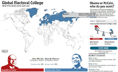 Here's an intriguing feature from the Economist, the formerly print-bound magazine that is moving creatively into the dynamic Web. Its "Global Electoral College" invites people in other countries to signal how they'd vote in the U.S. presidential contest. It presents a world map that assigns "electoral college" votes to each of 195 countries based on population. A "vote now" button lets people "vote" and then displays worldwide results on a map coded blue for Barack Obama and red for John McCain.
 So far, the more than 12,000 votes cast overwhelmingly favor Obama. Only El Salvador leaned red when I rolled my mouse around.
Monday, September 22, 2008
citizen journalists report from 'purple states'
I think the 'Purple States' section of washingtonpost.com is one of the most important interactive sections of the press.
It gives the audience the opportinity to cover the elections from their local towns.
Purple States citizen journalists join forces with washingtonpost.com to cover the issues that matter most to Americans leading up to election day
It gives the audience the opportinity to cover the elections from their local towns.
Purple States citizen journalists join forces with washingtonpost.com to cover the issues that matter most to Americans leading up to election day
Obama's Website: Past and Present
Slate.com has posted an article that shows changes in the information contained on Obama's website since the convention. Using Versionista, readers can follow links to specific portions of his website such as education, social security, rural-issues and Versionista gives both the previous Webpage and the current one side by side, with deleted information highlighted in pink and added information in green. This is really interesting because it allows us to see possible policy shifts that Obama has made since winning the nomination.
Comparisons like this, since they deal with a website are best communicated using the Web. The links allow for the actual article itself to be quite short while letting the user decide how much they want to read in to the facts. A user can either go by what the author is saying or investigate for themselves. Having the documents available at the click of the mouse is very credible for the journalist as well.
Comparisons like this, since they deal with a website are best communicated using the Web. The links allow for the actual article itself to be quite short while letting the user decide how much they want to read in to the facts. A user can either go by what the author is saying or investigate for themselves. Having the documents available at the click of the mouse is very credible for the journalist as well.
Yahoo!'s 2008 Political Dashboard
One interactive news site that presents information interactively that couldn't be done in print is Yahoo! News, which presents the electoral college map in its "Political Dashboard." The dashboard encourages users to take the map, which is pre-set with current poll data, and create their own scenarios as to how the election will play out.
Just for fun, it includes the scenarios drawn up by Arianna Huffington (which has Obama winning with 306 electoral votes) and Newt Gingrich (who says McCain will win with 300). In addition to the create-your-own-scenario interactivity, users can also view past maps for American elections dating back to 1988.
Just for fun, it includes the scenarios drawn up by Arianna Huffington (which has Obama winning with 306 electoral votes) and Newt Gingrich (who says McCain will win with 300). In addition to the create-your-own-scenario interactivity, users can also view past maps for American elections dating back to 1988.
Tracking the candidates across the nation
MSNBC.com's Decision 08 Dashboard is a Web site specifically designed to provide information about the presidential campaign using text, graphics, sound, video, and rich content. The focus of the site is on interactivity, not on in-depth news reporting, so there are plenty of visuals to attract the reader.
The most interesting feature I saw was the Maps & info graphic, which shows a map of the United States, with some states being marked with flags. When the user points his or her cursor over the flag, a text box pops up on the map. The text box tells the user which candidate will be in that state on which day, and for what reason. Users who are following the candidates now know what they are up to, and where to find them.
The site takes advantage of online journalism's multimedia capabilities, interactivity and ability to allow users to control what information they want to receive, which print and broadcast journalism cannot do. The map in particular probably employs rich content plug-ins, which allow rollovers to provide more information to readers.
Vintage Political Ads from Slate V
This video from Slate V features several vintage political ads. John Dickerson, Slate.com's Chief Political Correspondent, narrates the video and introduces the video by saying that because he's sick of this year's campaign commercials he visited the Museum of Moving Images to track down some of his favorite political ads from the last 60 years.
While it could be argued that this video might appear on the evening news, it probably wouldn't because of its length. The ads are somewhat long and need to be watched in their entirety to fully appreciate them. There's even a link posted under the video that takes viewers to the site where Dickerson found the videos so viewers can check out more on their own time.
While it could be argued that this video might appear on the evening news, it probably wouldn't because of its length. The ads are somewhat long and need to be watched in their entirety to fully appreciate them. There's even a link posted under the video that takes viewers to the site where Dickerson found the videos so viewers can check out more on their own time.
Politico: "where red and blue meet purple."
Politico's website offers a 2008 Swing State Map that is quite informative. The map allows users to click on each of the swing states for the 2008 presidential election, and gives facts about how that state has affected each election. This map gives up-to-the-minute data at the request of the user -- something a newspaper or television would not be able to do. The data goes back to the 2000 election, and users are able to see if a particular swing state favors Obama or McCain, and how winning (or losing) that state will affect wach candidate's chances at the presidency.
USA Today's way of keeping score
My site is USAToday.com. The story I chose was “McCain has biggest spending month in August”. A newspaper or TV broadcast could not accomplish this arrangement because the story is accompanied by both an electoral vote and campaign ad tracker. A TV broadcast does not have the time to get into the details of the story like a newspaper, yet the newspaper cannot offer the multimedia options of the television because it is impossible. Not to mention, the story includes active links so that users can find out more information on the particular people involved with the story. With this story, users get the best of bother worlds.
CQ Politics: Build Your Own Presidential Race
The interactive presidential map on CQPolitics.com allows users to project their own scenarios of the election outcome. For example, clicking on the swing state of Colorado shows that, all other things being held equal, even if it went red Obama would still hold a lead over McCain.
This multimedia type could not work in any other medium. A TV station or newspaper could provide a colorful map of any given poll results for election outcomes, but neither would have the option of personalizing the outcome of each state to see potential results.
CQ Politics also gives a historical timeline of presidential elections since 1968, showing which state went to which candidate and further breaking it down by electoral votes per state when clicked on. Another "purple" map gives the average percentage-point margin of victory in each state for the past five elections, and yet another shows the national breakdown based on the site's own race ratings.
The nature of interactivity in online journalism allows for such enhancements that would not otherwise be possible in print, radio or broadcast journalism.
MSNBC.com users predict election outcome
MSNBC has an interactive feature called iPredict, in which users can predict the outcome of the presidential election. There is one chart for " John McCain will win the U.S. presidential election", and likewise one for Barack Obama. The user selects and clicks one symbol indicating two thumbs up, one thumb up, thumbs down or sideways based on how likely they think that outcome is. Sideways means "toss up". The graph for McCain shows a big spike in users who said a win was likely after the Palin nomination. Users can switch views between the past month, 3 months, and 1 year. It also gives data on number of voters, average vote, and percent change over the past week. One thing it seems to be missing, however, is a way for the user to view both graphs at the same time to compare what readers predict for Obama and McCain. The feature is obviously interactive because it allows users to give their input in some way, and compiles all the votes to create a data set based solely on user input. It would be interesting to see those kinds of numbers for readers/viewers of different newspapers and tv stations, , but can't be done through either of those mediums.
WSJ: Interactive Graph of Pre-Election Polls
Wall Street Journal's interactive graph allows users to track pre-election presidential polls taken by different news firms and polling groups in key battleground states and nationwide. John McCain and Obama are positioned vertically on the graph with the midpoint of zero representing a tie. The timeline starts in June and the media companies are color-coded.
Some key states include Virginia, California, Pennsylvania, Ohio and Florida. Media firms include CNN, USA Today, CBS and Newsweek.
This graph allows users to select which information they are most interested in looking at on the graph, an interactive feature of user control that is a characteristic of online news. For example, they can select the media firm whose poll they are most interested in and select which key state they want to see by clicking on the tabs. Given the number of space and time in media such as newspaper or television, editors and producers will most likely have to select which key states and media polls they think are most important to the reader.
The Forum on CNN.com
"The Forum," an interactive part of CNN's online Election Center, is exciting to both the politically-proud and the politically uneducated. A venue for viewers of all voting types (targeting those who label themselves first time voters, political junkies, conservatives, independents and/or liberals), visitors to the site can find where they stand on issues compared to other site participants and share (or simply read) political opinions and/or concerns on several comments pages. Visitors can join "leagues" of voters and share their comments more specifically with people who have similar political ideas.
The purpose of the site is to, through interactivity and visitor participation, encourage dialogue among voters in the upcoming presidential election. This could not be done at the same degree by a print publication, radio or television broadcast because such media could not handle the same amount of traffic; a virtual dialogue can support the involvement of MANY more participants than a newspaper article, radio or television panel.
The purpose of the site is to, through interactivity and visitor participation, encourage dialogue among voters in the upcoming presidential election. This could not be done at the same degree by a print publication, radio or television broadcast because such media could not handle the same amount of traffic; a virtual dialogue can support the involvement of MANY more participants than a newspaper article, radio or television panel.
Pick your President on Washingtonpost.com
Users can give their best guess of who is going to win the presidential election in Washingtonpost.com's Pick Your President Contest. The contest allows users to pick which candidate will win each state and automatically tally's the electoral votes. Users look at a map and click once to give a state to Obama and twice to give the state to McCain. The interactive map provides historical information about the previous outcomes in each state as the mouse is scrolled across the state. The user can also see trends amongst other people who have filled out the map, maps submitted by others and the latest campaign research. Once they make their picks, the user names their map, provides a brief explanation of their picks and enters their contact info. The person with the highest correct score in the electoral college voting wins a $500 Best Buy gift card. This allows users to create and share their own content and even potentially win a prize for it. A newspaper or TV station does not have the ability to recieve direct information from users like the internet does.
New York Times' Presidential Polls
The New York Times Web site has a tool which allows a user to look at the most recent data from 14 national polls -- including USAToday/Gallup and Pew -- and 10 state polls about the 2008 U.S. presidential election. The Times charts the data, showing how the polls have changed over time. Users can scroll their mouse over a point in the graph and more information: the date of the poll, the exact percentages and the margin of error appear.
This kind of chart couldn't be achieved in any other medium because it is completely interactive -- the user in in control of what he or she wants to look at and click on. It also centralizes the major presidential polls in one place, providing ease of use in addition to interactivity.
This kind of chart couldn't be achieved in any other medium because it is completely interactive -- the user in in control of what he or she wants to look at and click on. It also centralizes the major presidential polls in one place, providing ease of use in addition to interactivity.
See How They Run on ABC News
ABCNews.com has an interesting poll tracker on their politics site. What they've done is set up a poll tracker between Obama and McCain. The tracker is interactive so you can select things like "overall", "age", or "income" to see how different people vote depending on their background. You could present the same information in a newspaper but only as a very large graph. It is much easier to use the interactive version on the internet because it is much more concise and can easily and quickly narrow down the exact information you're looking for in voting habits. This is a prime example of how the internet can make news much more user friendly then trying to quickly catch the information in a television news program or read in a complex graph in a newspaper.
Patchwork Nation
Patchwork Nation on the Christian Science Monitor's website breaks down states counties and classifies them not only by the party for which they usually vote, but also by 11 categories (boom towns, evangelical epicenters, immigration nation, etc.). Each category has a profile with polling data, and CSM has bloggers reporting from a representative city in each category. There is no way that the CSM could use print or television media to pull this off; the nature of the Patchwork Nation makes it a non-linear report, meaning that television could not pull it off. And, the interactivity required in exploring the different traits of the various regions could not be done in a newspaper. Sure, CSM could print the map, but it loses so much without the rollover profiles and the instant access links to the category's blog, that it would not be anywhere near as complete.
Washington Post Interactive Electoral Map and Contest
The Washington Post has an interactive electoral map as well. You pick which states will go to McCain and which states will go to Obama, then enter your map into a contest. The winner gets a $500 gift certificate to Best Buy. They also have a feature called "starting picks" which helps you fill out your map. One, swing states, gives each non-competitive state to its appropriate candidate and then leaves the swing states left to fill out. Another "starting picks" feature will highlight the map by the 2004 results. What is unique about this compared to Tv and print media is that it can go through all the potential electoral scenarios in a much faster and easier to visualize and understand way. It also allows for instantaneous response to a contest/promototion that TV or print media could never get.
Monday, September 15, 2008
Breaking News, Large Sites: NYTimes.com, Eliot Spitzer's Resignation
The New York Times won the category in Large Sites for breaking news. According to The Online News Association, "The winner 'hit it out of the park.' The winner could have held the story but chose not to.”
The New York Times was able to break the story with through tips and keen reporting when they learned the unusual presence of lawyers and an FBI agent in a federal district court in Manhattan. But what was particularly unique was they broke the story on the web instead of holding it and continually updated it throughout the day while no one else had anything.
On the website, they included video, timeline and also provided answers on how they broke the story through a Q&A through their metro blog which provided a platform for users to comment and ask questions.
For Breaking Online News Content, NYTimes Rings True
For using web resources to break the news of Eliot Spitzer's resignation and link to a prostitution ring, The NYTimes.com won the Breaking News award for large sites as part of the Online News Association's Online Journalism Awards Sept. 13 in Washington, D.C.
NYTimes.com created a superb multimedia web package devoted to all-things Spitzer when the story broke in March. It offers an interactive way to expand their coverage of the story and feed readers' need for news. If seeing a video of Spitzer's tear-filled apology isn't enough, an interactive timeline of his life and career highlights-- complete with pictures-- offers readers another glimpse into the former Governor's life.
In addition to linking all relevant stories, the package includes a podcast and link to an in-house bio complete with all archived Times stories relating to Spitzer.
This gives readers a place for one-stop shop coverage, and its easy-to-navigate, reader-friendly site makes the Times worthy of its award.
Las Vegas Sun Shines Online
The Las Vegas Sun’s website, which was the winner of the General Excellence category for medium sites in the 2008 Online Journalism Awards, provides a ton of information in an easy to use format while taking advantage of multimedia potential. When first looking at the page, it is clear that the first priority is news. It has the latest news at the top of the page, followed by prominent stories in other news categories. The front page provides so many things to look at, yet is not overwhelming. It also encourages readers to get involved by providing a “Most read,” “Discussed” and “Most E-mailed” near the top of the main page.
Once you scroll down a bit on the main page, the multimedia aspects of the site shine through. Currently in their “spotlight” section, they have a history of Las Vegas with tons of multimedia options, all of which are interesting and informative. The interactive casino map provides a more interesting look at the strip than just reading about what each casino offers. The “Implosions” section provides some fun (who doesn’t want to see an empty building being blown up) and some history, with a blurb about each of the casinos that are no longer standing.
Off the main page, in addition to the usual Arts and Entertainment, Sports and Opinion sections, the links off the top also include an entire multimedia section. This section includes videos, slide shows, and other multimedia options on everything from sports to a flight delay calculator. There is also a blogs section covering all topics with multiple blogs on each one. Most of the blogs had been updated within the past week, and some had been updated within the last few hours. Overall, the site serves those living there with the latest news as well as those visiting or looking for information with their variety of articles and multimedia sections.
"Bearing Witness" to an Award-Winning Multimedia News Site
After looking at the Web sites of the Online Journalism Award winners, I observed that the incorporation of multimedia is key to creating a successful news site. Reuters’ online feature “Bearing Witness” is one such site; it was named the best news site for a Multimedia Feature on a large site. The site tells the story of the Iraq War through testimonials from Reuters reporters, photographers, and other staff using photos, audio and video.
I find using multimedia elements is more effective in creating an emotional impact on viewers (specifically myself) than simple text. Not only do photos, audio and video on the site spotlight journalists who were on the ground, they also depict war photos and footage that bring their personal stories to life and make them much more compelling than they would be in textual form.
Other features such as a comprehensive timeline and maps provide further understanding of the war for those who would like to know more.
Subscribe to:
Posts (Atom)
